Summer 2020
Open Ceilings Magazine
Final Cover Design, Arts and Photography final layout design, and final illustrative motifs.
Open Ceilings Magazine
Final Cover Design, Arts and Photography final layout design, and final illustrative motifs.
Open Ceilings is unique from other literary publications on the UC Davis campus because they seek to publish works that increase representation in a number of marginalized communities, as well as producing insightful collaborations between writers and artists. As both a board member and editor, I worked in tandem with the Layout Director, as well as cross-collaboratively with the other members of the board.
As the Arts Director, my responsibilities included not only developing motifs for designs that would end up in the final product, but also reaching out directly to the art and photography community in Davis for submissions purposes. It was a wonderful chance to see the type of artistry that is unique to UC Davis students, as well as cultivating a relationship between Open Ceilings and the Arts and Design departments.
Above and below: Cover illustration mock ups
As submissions for the Summer 2020 edition poured in, the Layout Director and I began iterating designs for what would become the final layout. This process took about three months to solidify our designs with the Director Team, as well as the rest of the board.
From left to right: Artist profile layout draft, cover inspiration, poetry layout draft, short fiction layout draft.
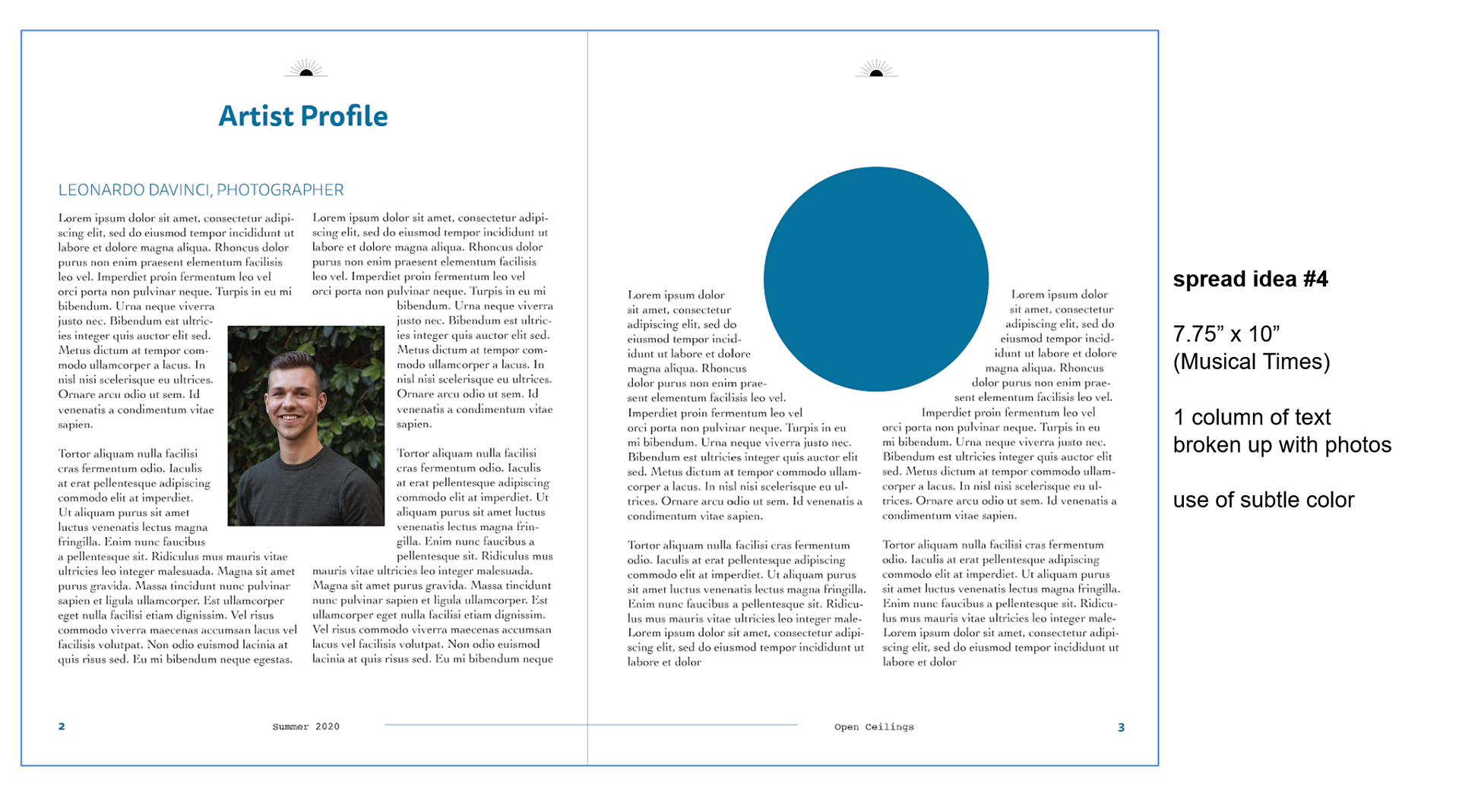
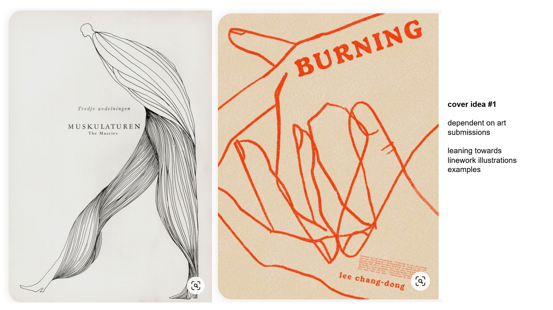
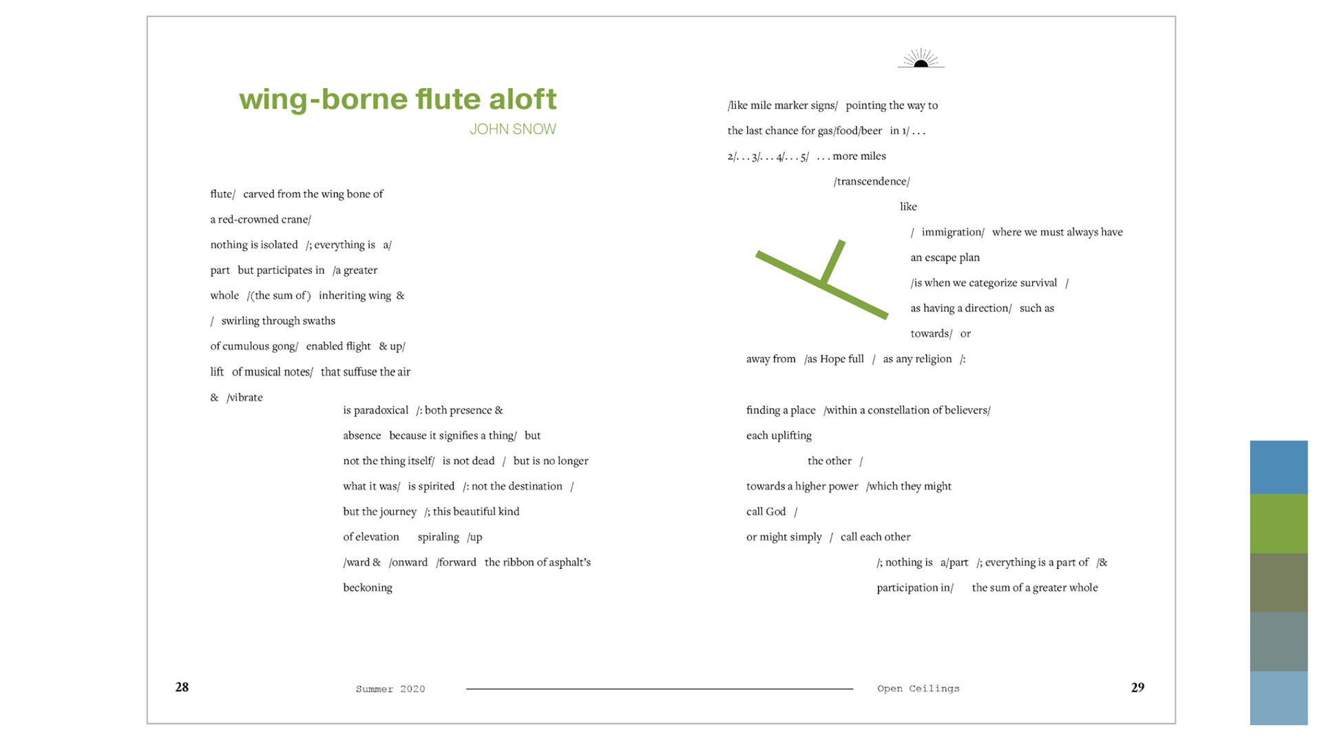
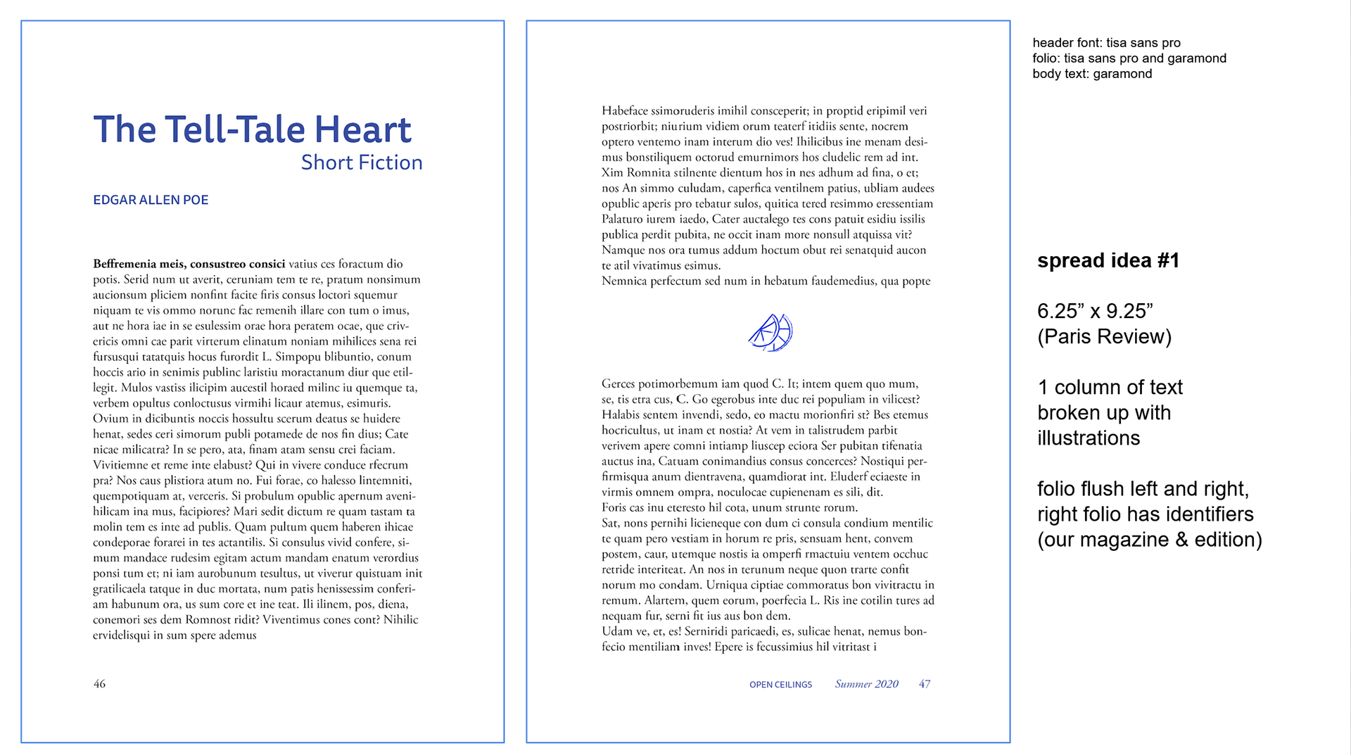
After finalizing the layout for the written portion of the book, we began exploring concepts for the front cover, as well as the dividers which would mark each section within.
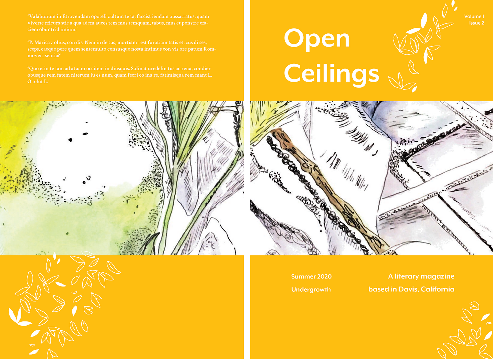
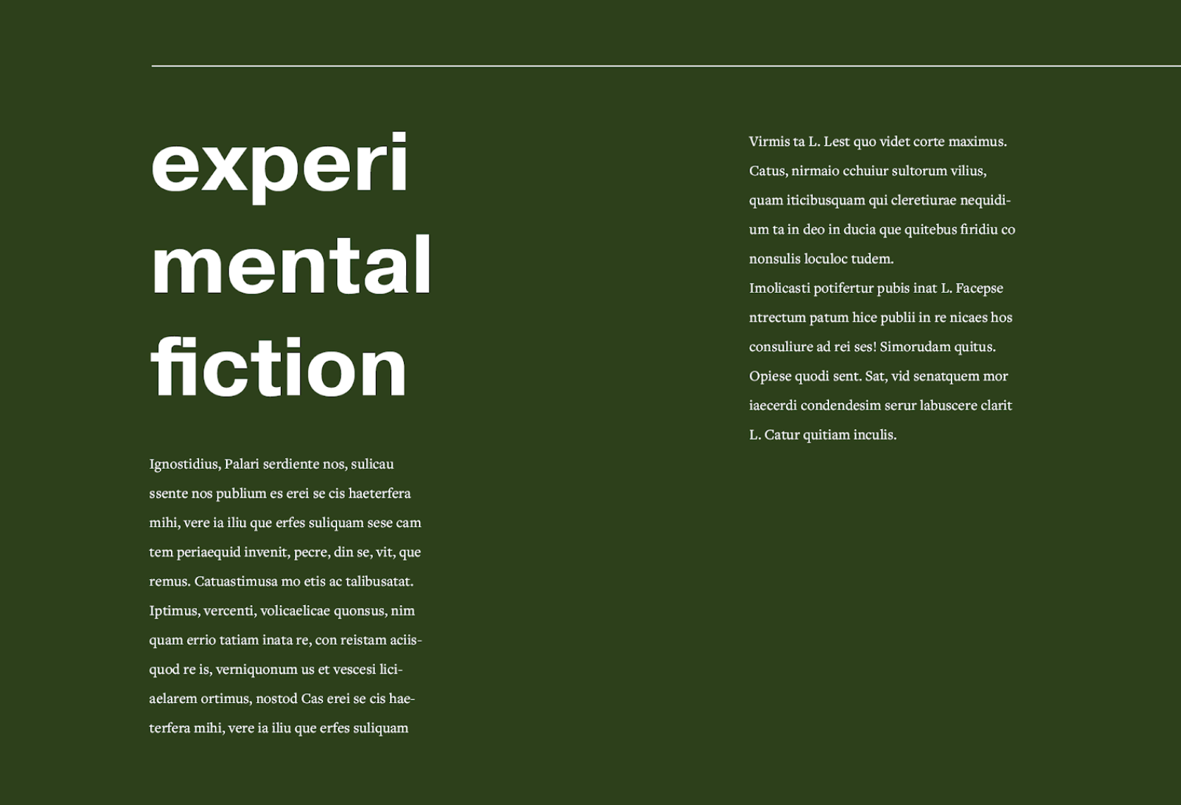
From left to right: first iterations of cover, collaborative iteration of cover between myself and the Layout Director, experimental fiction section divider.


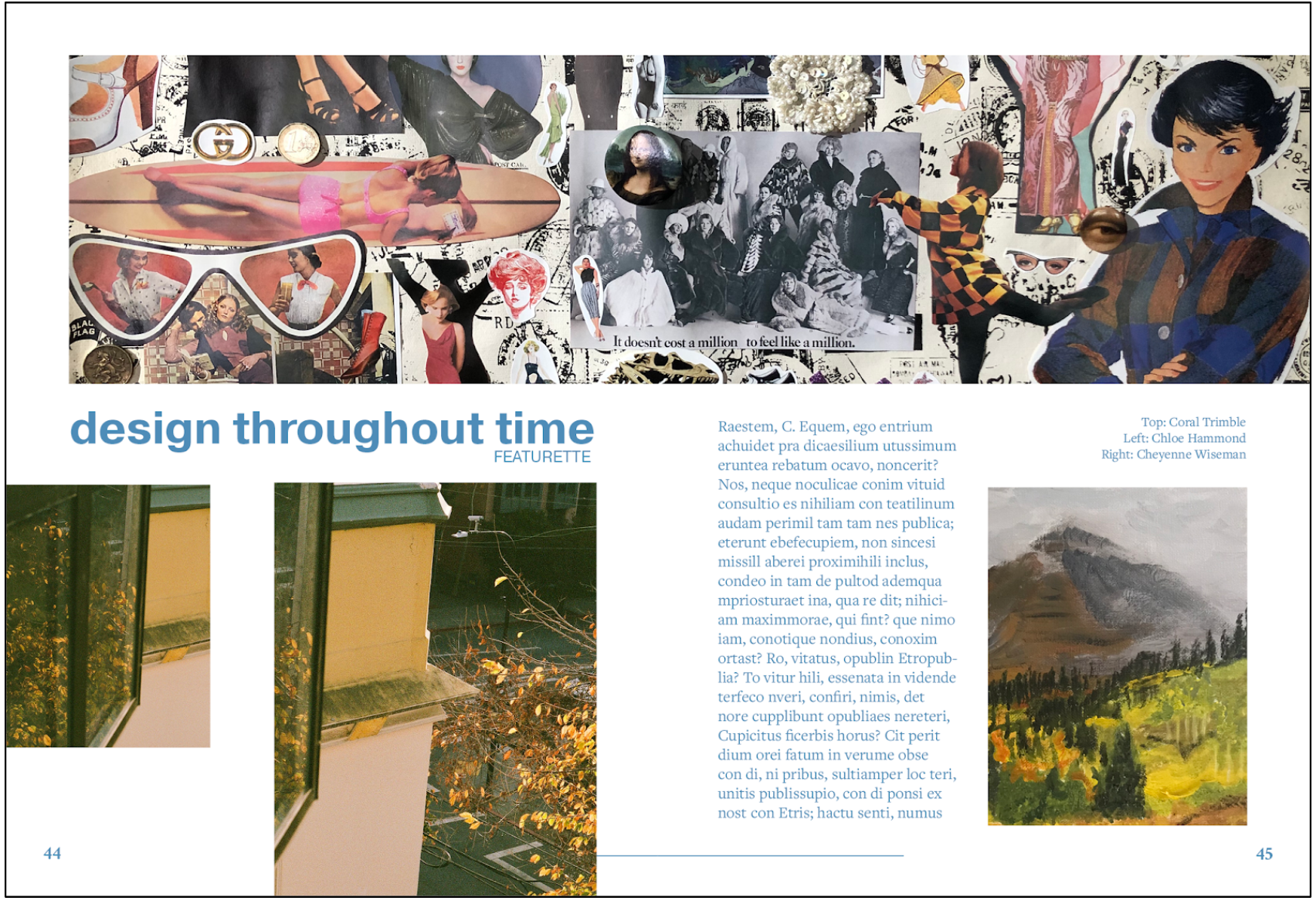
From left to right: iteration of poetry layout with the inclusion of a submitted photography piece, iteration of an art feature to include a particular contributors work with an accompanying interview.

Once a majority of submissions were approved, we began inserting them into what would become our final layout.
Left to right: first iteration, final design.

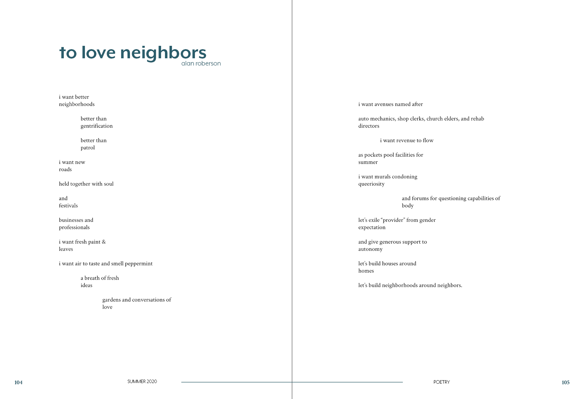
Below: final draft of poetry layout.
Below: first draft of writing feature.

Below: final draft of writing feature.
From left to right: first draft of poetry with inclusion of photo submission, final design.
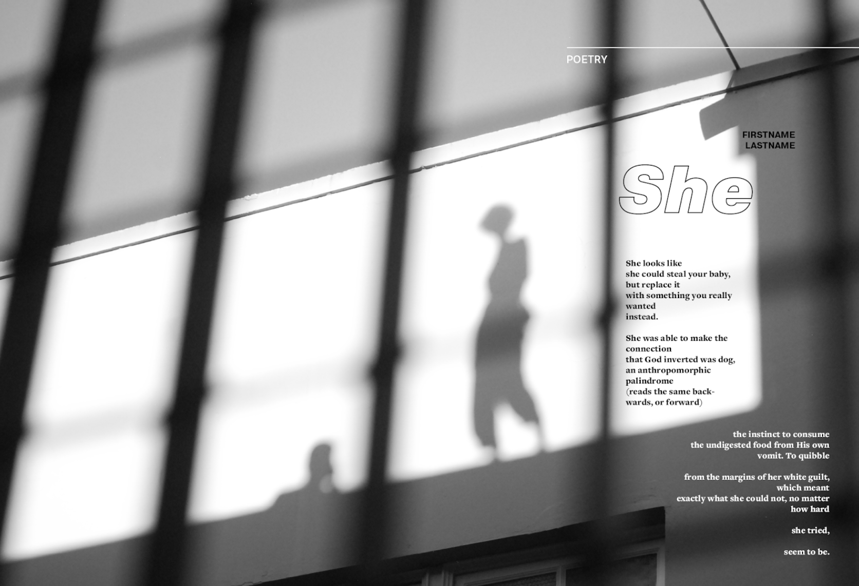
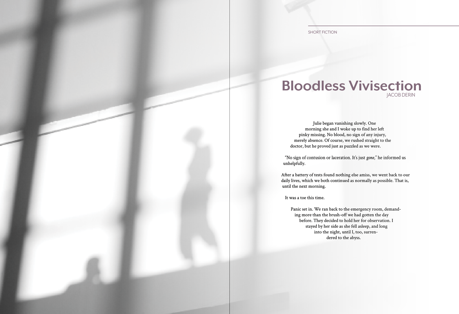
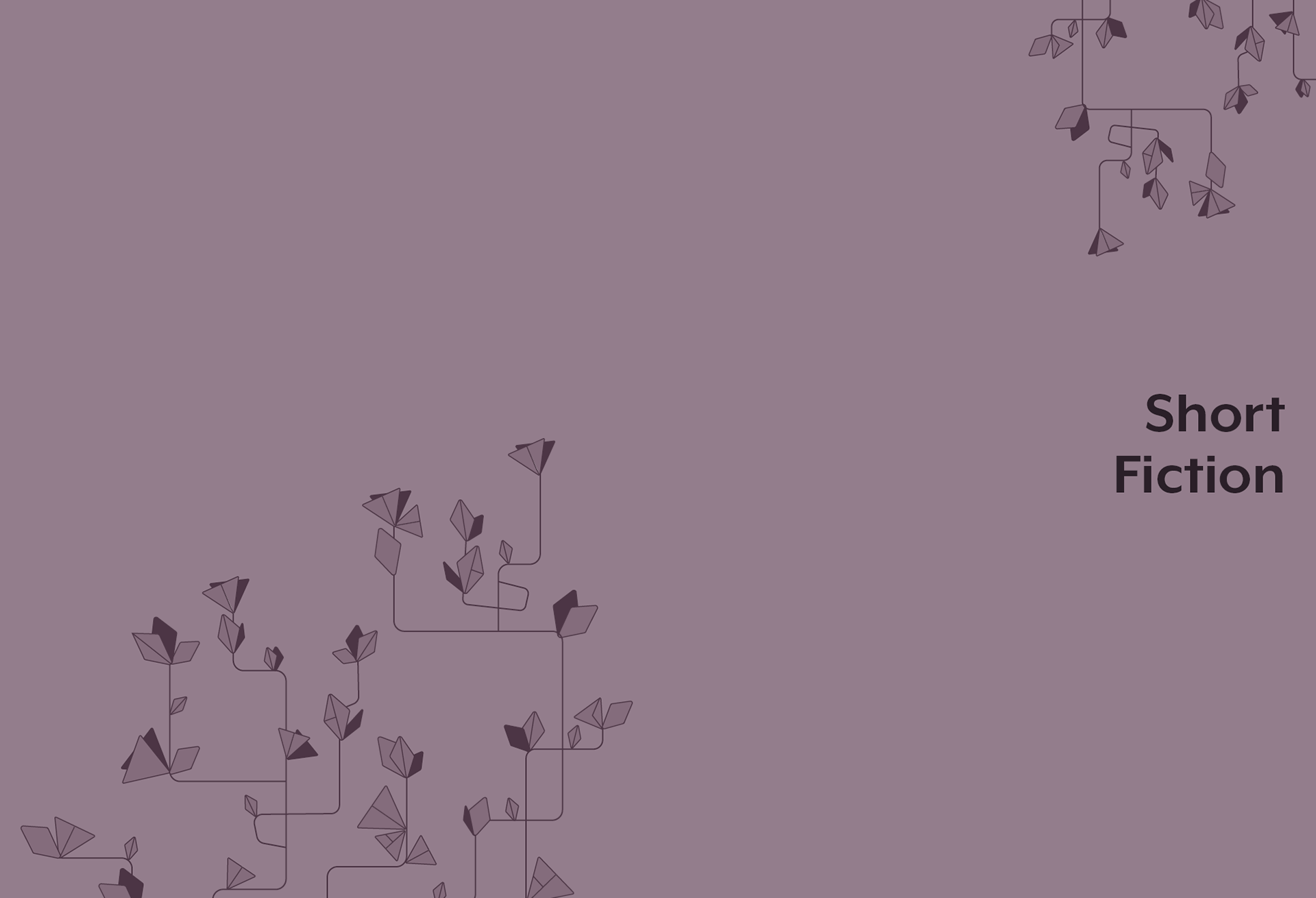
From left to right: first iteration of what would evolve into our short fiction section, final design for section divider.
Below: final design for artist and photography features.
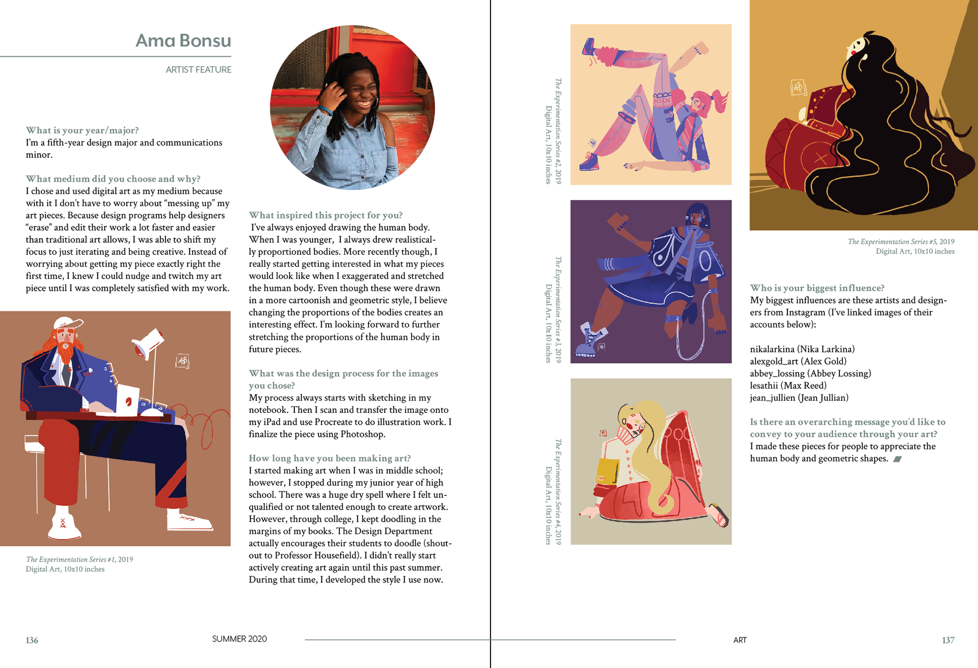
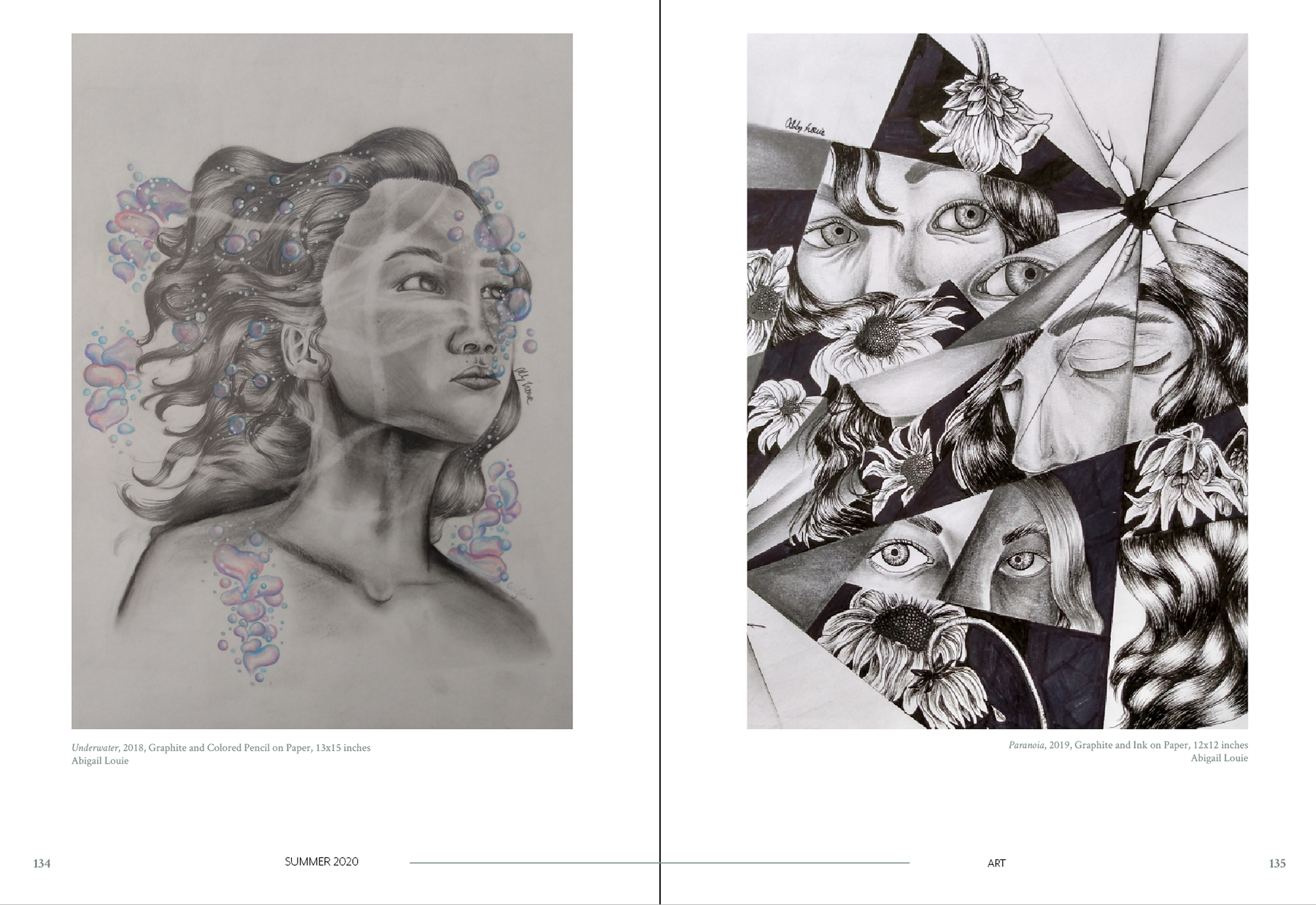
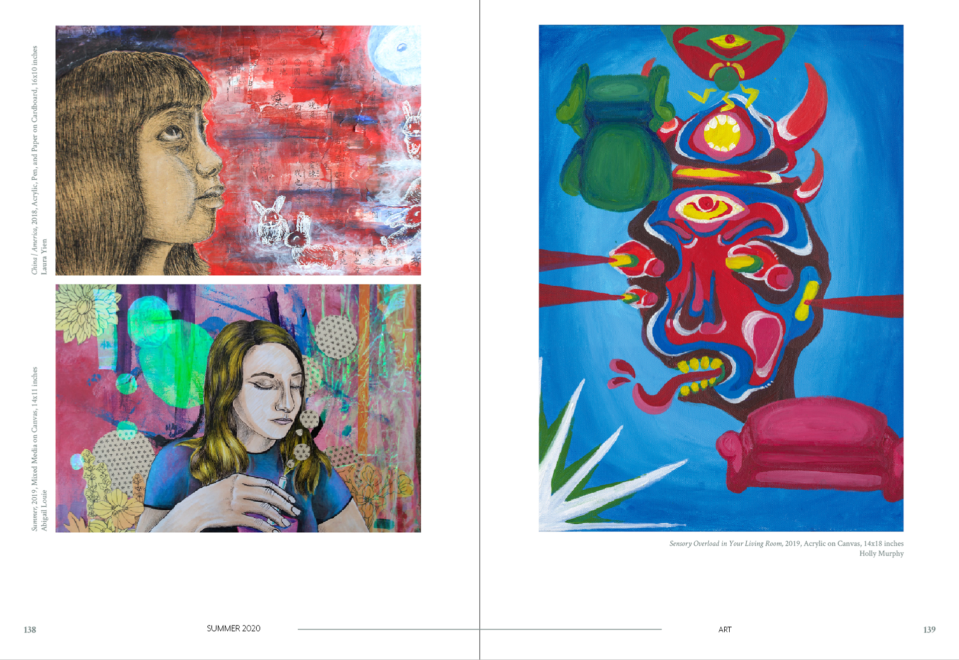
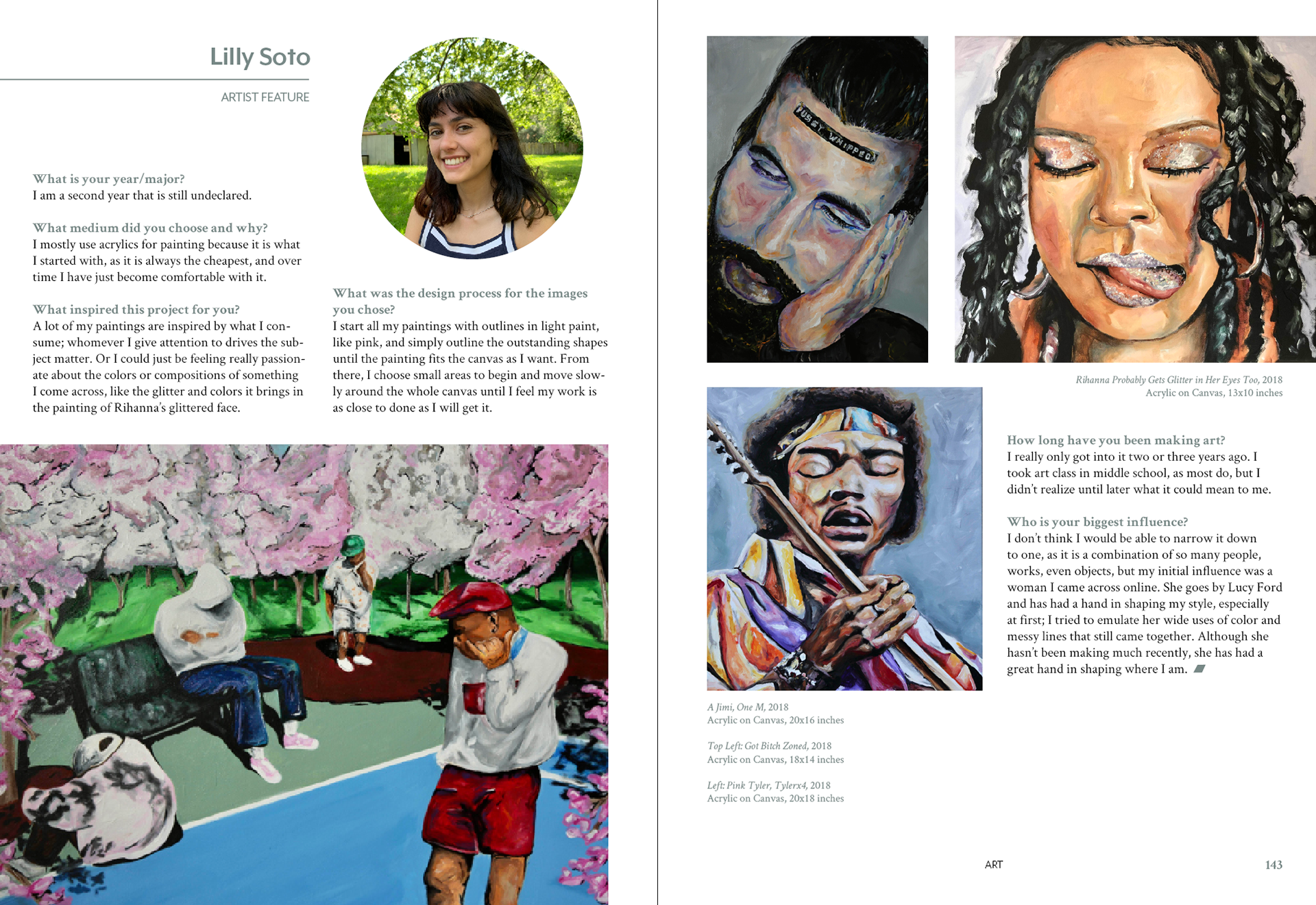
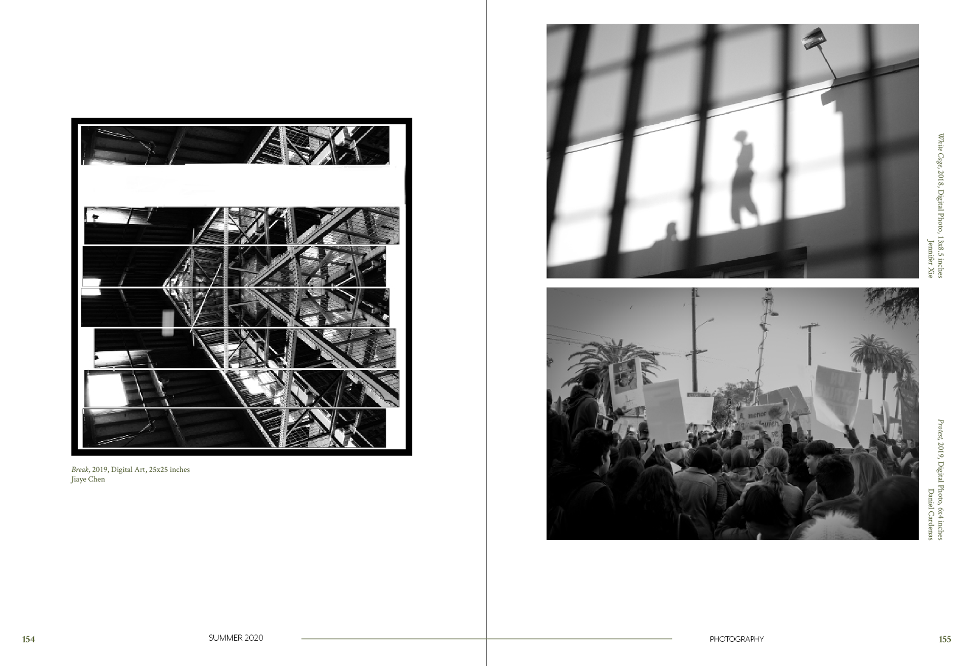
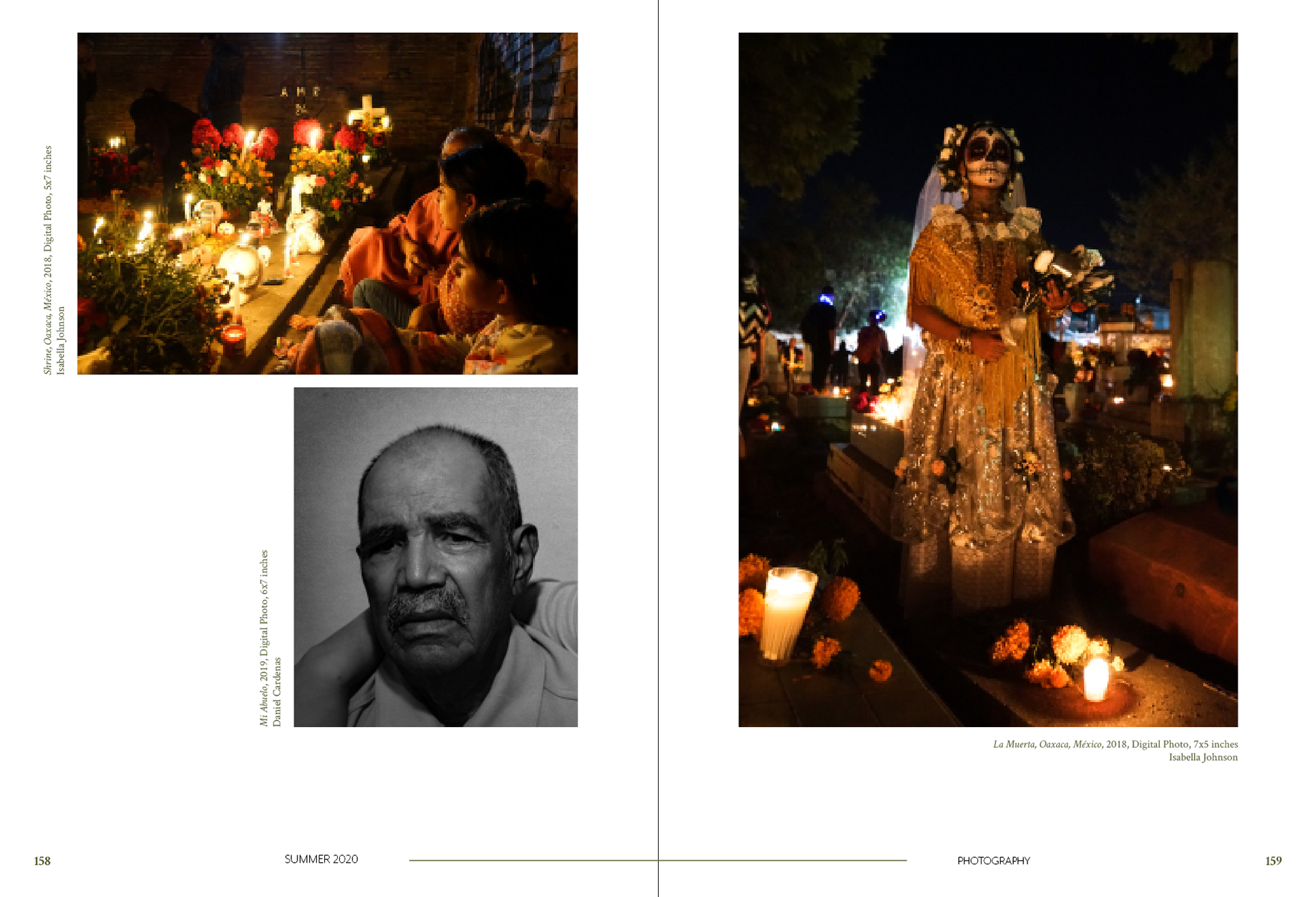
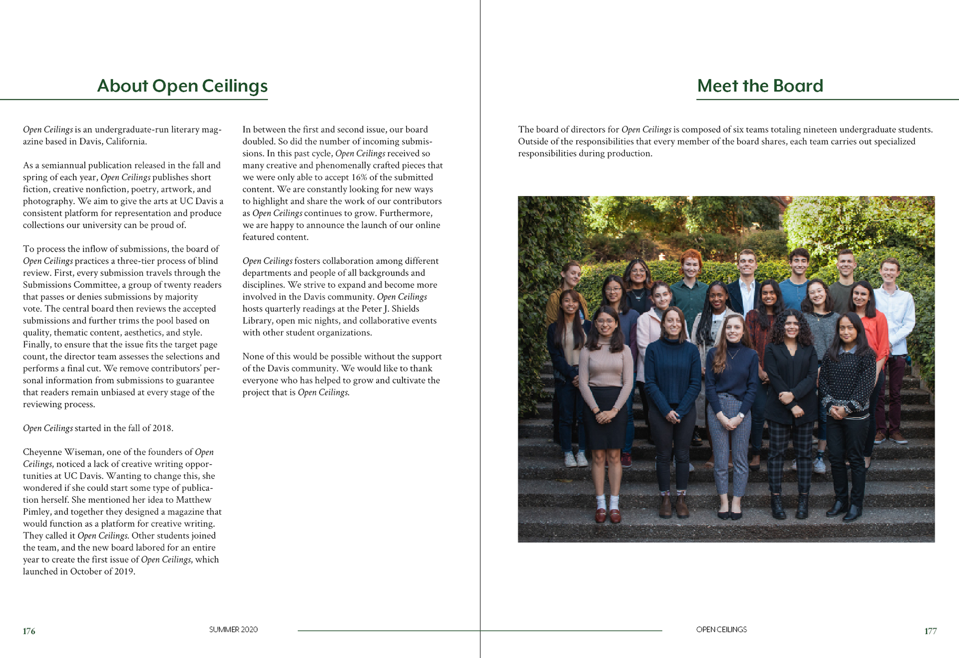
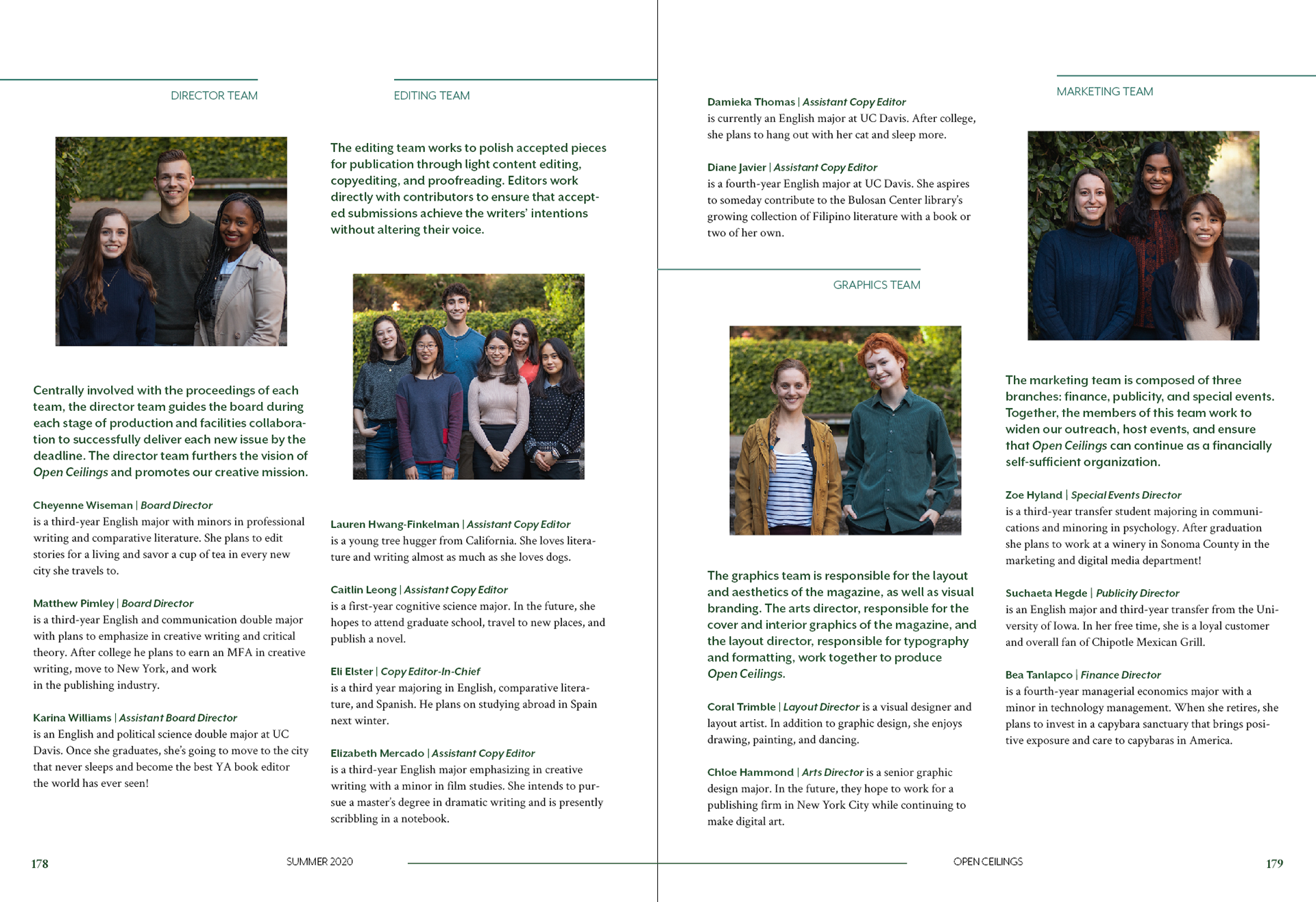
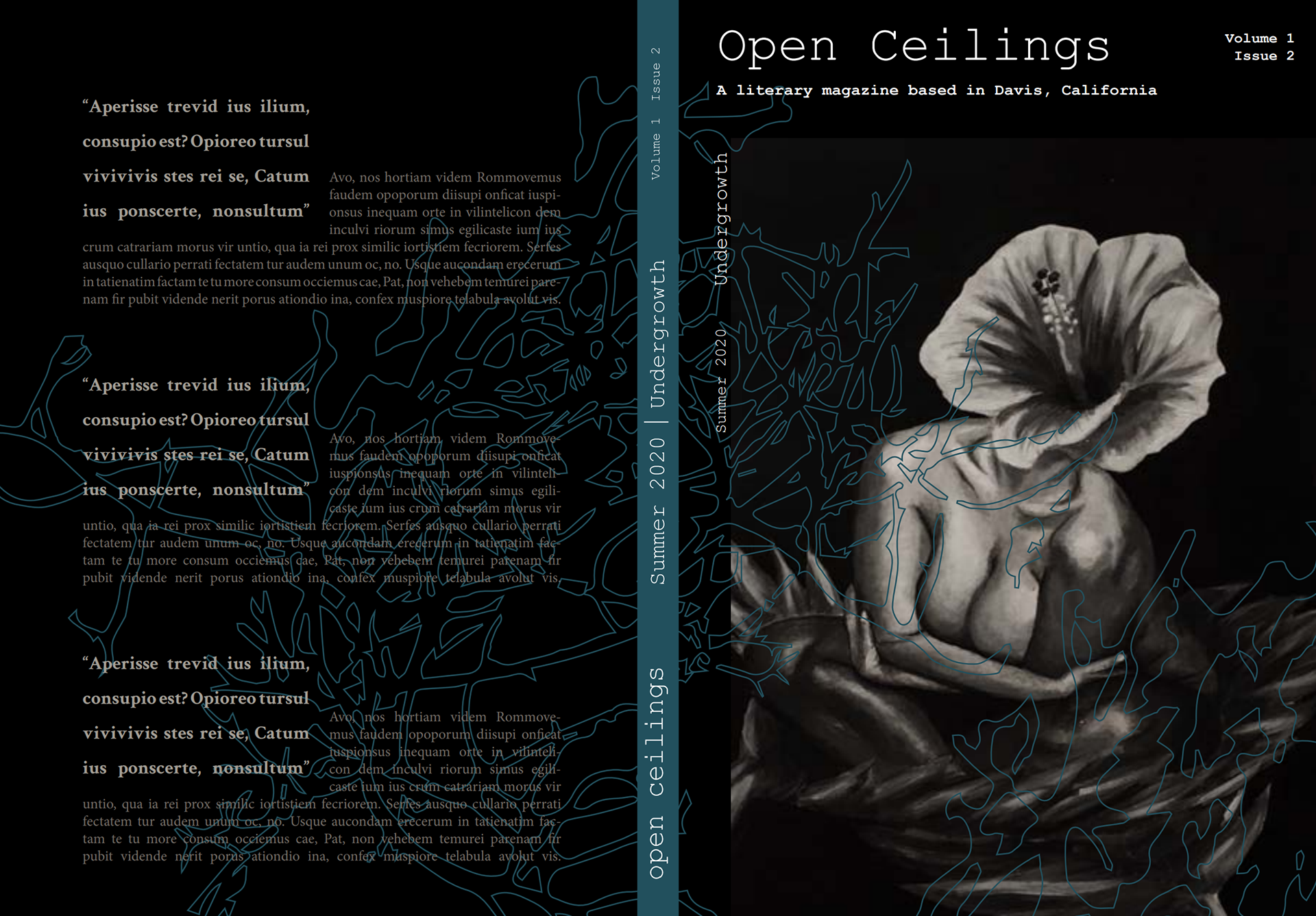
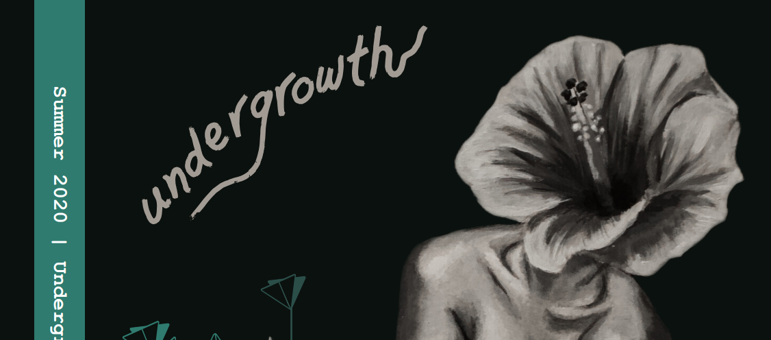
Finally, our cover design began to take shape after numerous iterations.
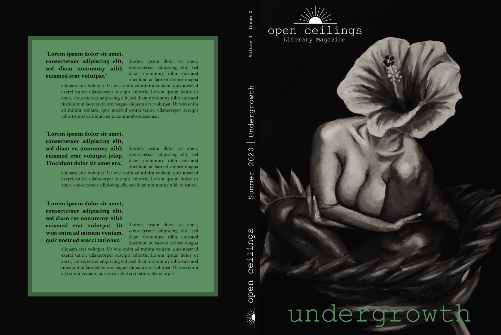

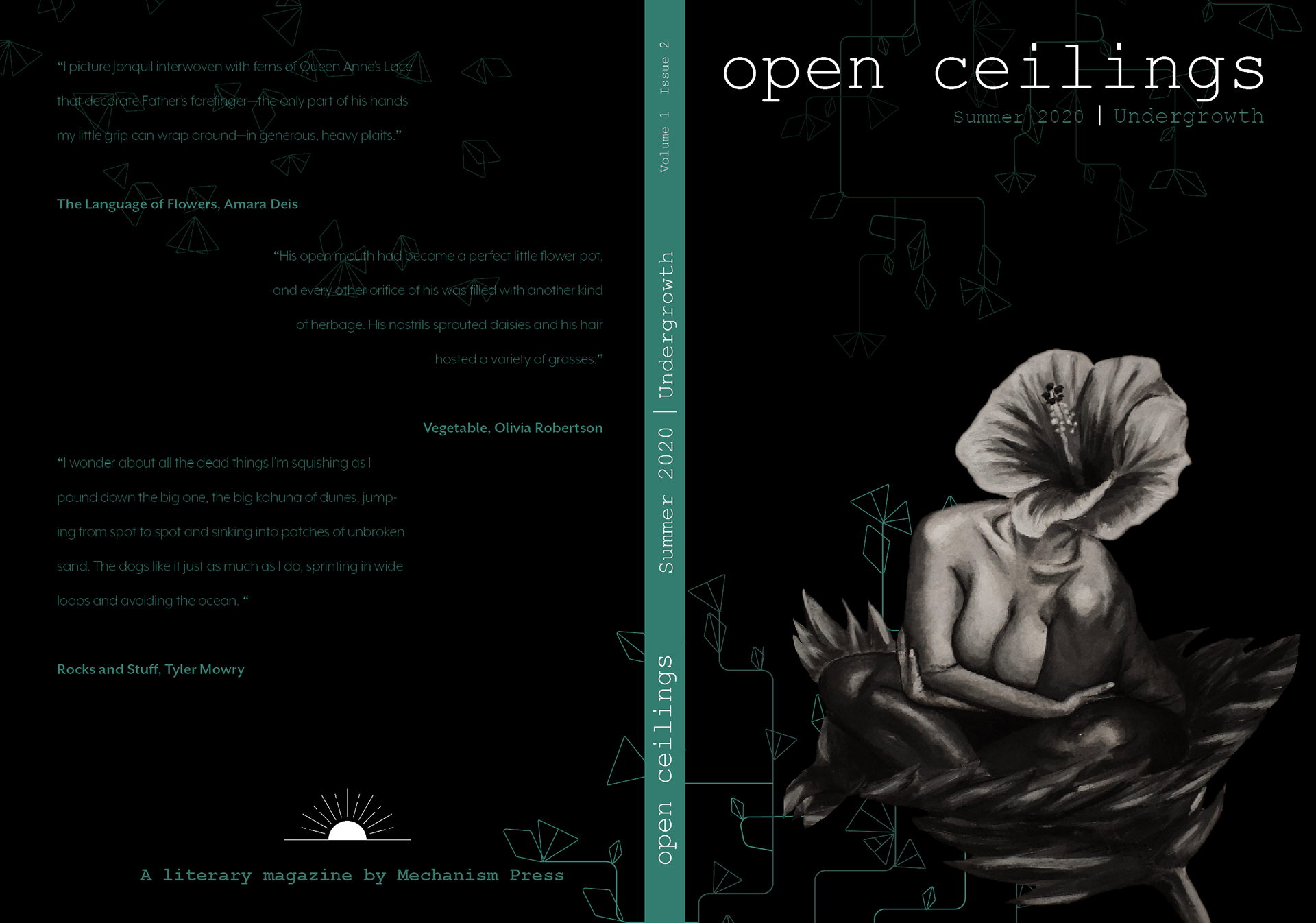
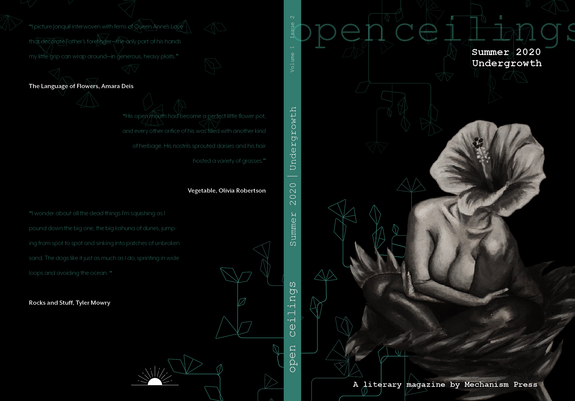
Below: final cover design.

As I reflect on this opportunity, it was one filled with immeasurable growth. This was a job of firsts: my first time collaborating with a board of talented thinkers, writers, and artists; my first time approaching layout design outside of the classroom; and my first time incorporating my own illustrative style to a long term, multi-layered project.
One aspect I really enjoyed was the consistency between my cohort, the Director Team, and the rest of the board. Weekly meetings were not only imperative, but sped the process up significantly. It also allowed the Layout Director and I to continue to iterate a new version of the layout each week, which informed our final product and put us at ease about whether or not we spent enough time on our specific projects to be satisfied with the end result.
Overall, I want to improve my dedication to iterating and improving based on my cohorts feedback and advice. Simply put, I want to develop a strong sense of what my client is envisioning for a particular project in the future. I learned that my strengths lie in cover design where there is an intersection between information and illustrative creativity.
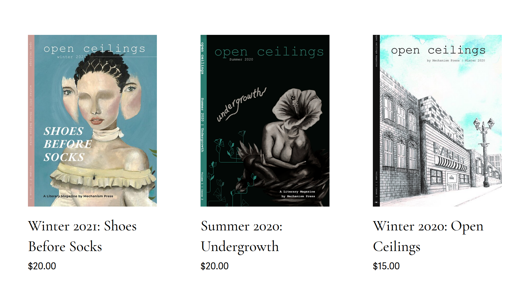
The Summer 2020 edition - as well as their newest publication - is available to purchase on their website:
